Smoogly is a project developed together with Marketing students. Our goal was to create a product to reduce the waste of ugly fruits due to their look, showing people that these ugly products can still taste good. We designed a vending machine of smoothies and took advantage of humor to sell this idea.
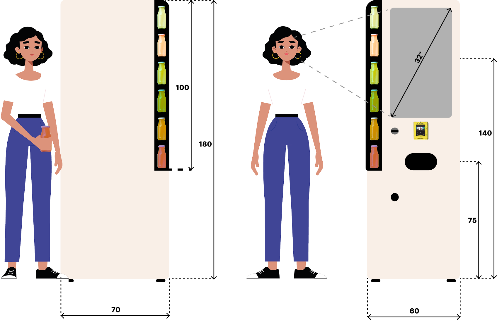
Project prototype. Interactable area corresponds to a 32" TV. View in fullscreen

For this project, our Advanced Project class was merged with the "Better Marketing for Consumer Wellbeing” class from the Master of Management course at Nova School of Business and Economics.
The ideia? To mix together our skills in Management and Design to create a more complete project, involving launching capabilities and simulating a real-world scenario.
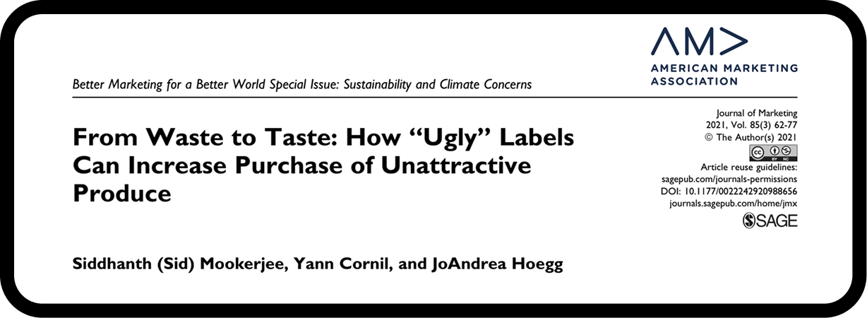
We focused our work on this research
-
Main findings are:
- Users expect fruits to be beautiful, but fruits come in all shapes and sizes
- Calling a fruit ”ugly” corrects user’s expectations and makes the fruit's appearance more bearable
- Better when paired with an "optimum discount", such as 30% cheaper than the "beautiful" fruits

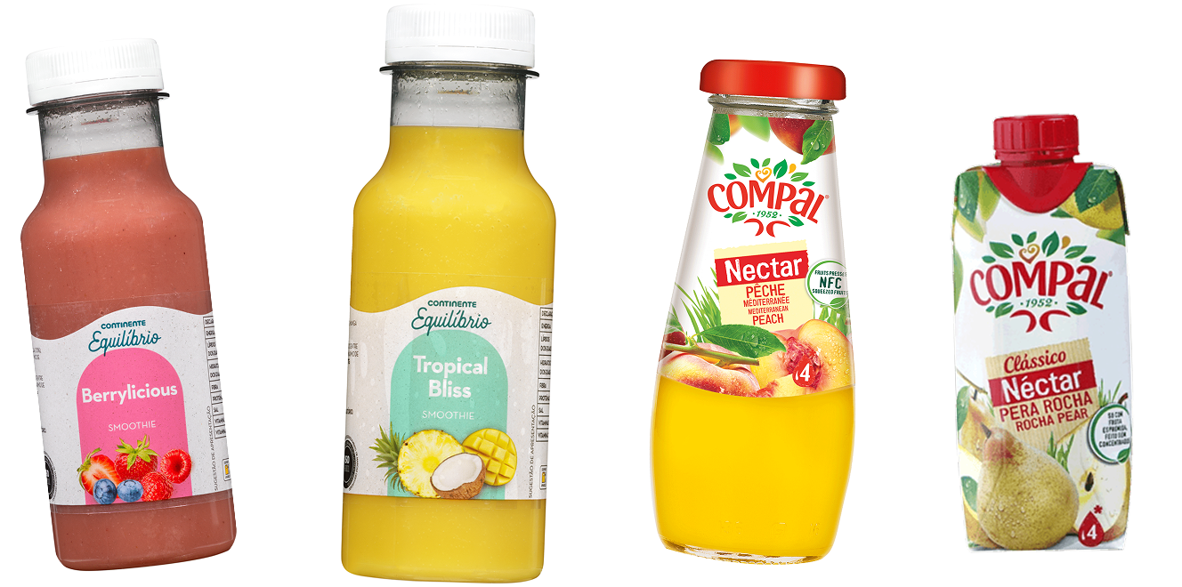
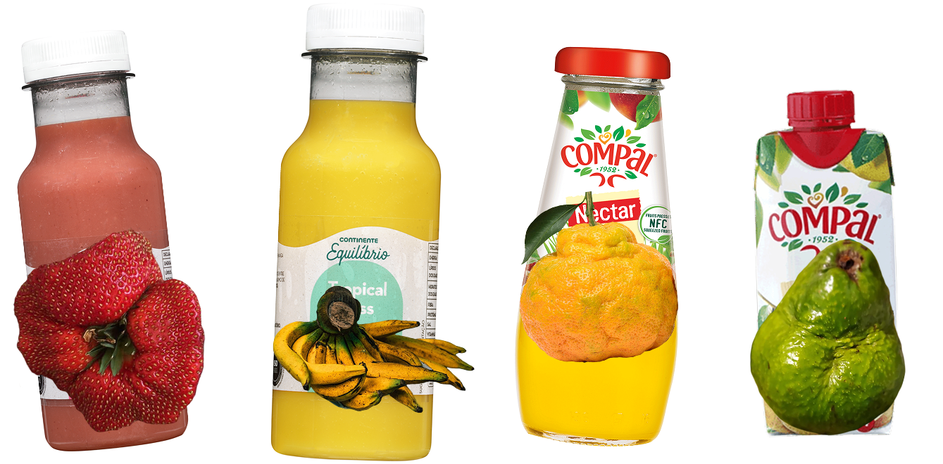
But... juice and smoothie companies already use ugly fruits for their production!
However, let’s take a closer look on how these fruits are usually represented:

If people discover that ugly fruits are so tasty and sweet that are capable of producing delicious smoothies...
They will be more likely to buy ugly fruits and vegetables, reducing waste!
Reduce the waste of good fruits and vegetables because of their ”ugliness”
PROJECT OBJECTIVE

We found a lack of healthy options on the ”on the go” market, such as University campuses and Metro stations, that are usually filled with calorie and sugar-packed options.
Our customer is a young person, around 20-28 years old, who values health-conscious products that prioritizes wellbeing and environmental sustainability. They seek exciting and interactive purchases, valuing unique experiences, and are enthusiastic about environmental concerns and food waste reduction.

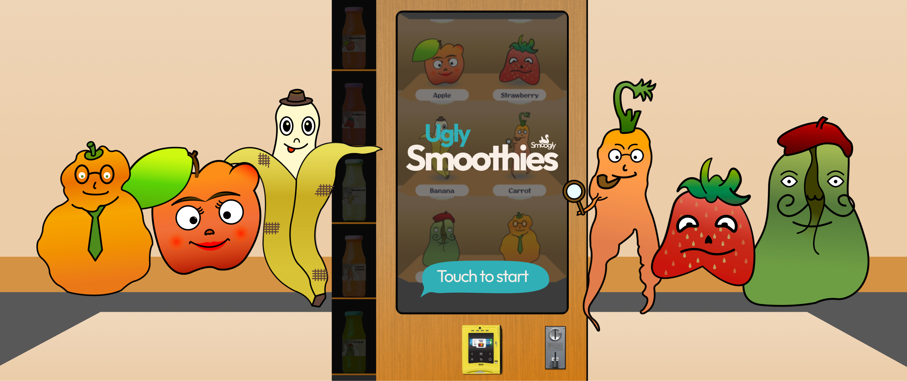
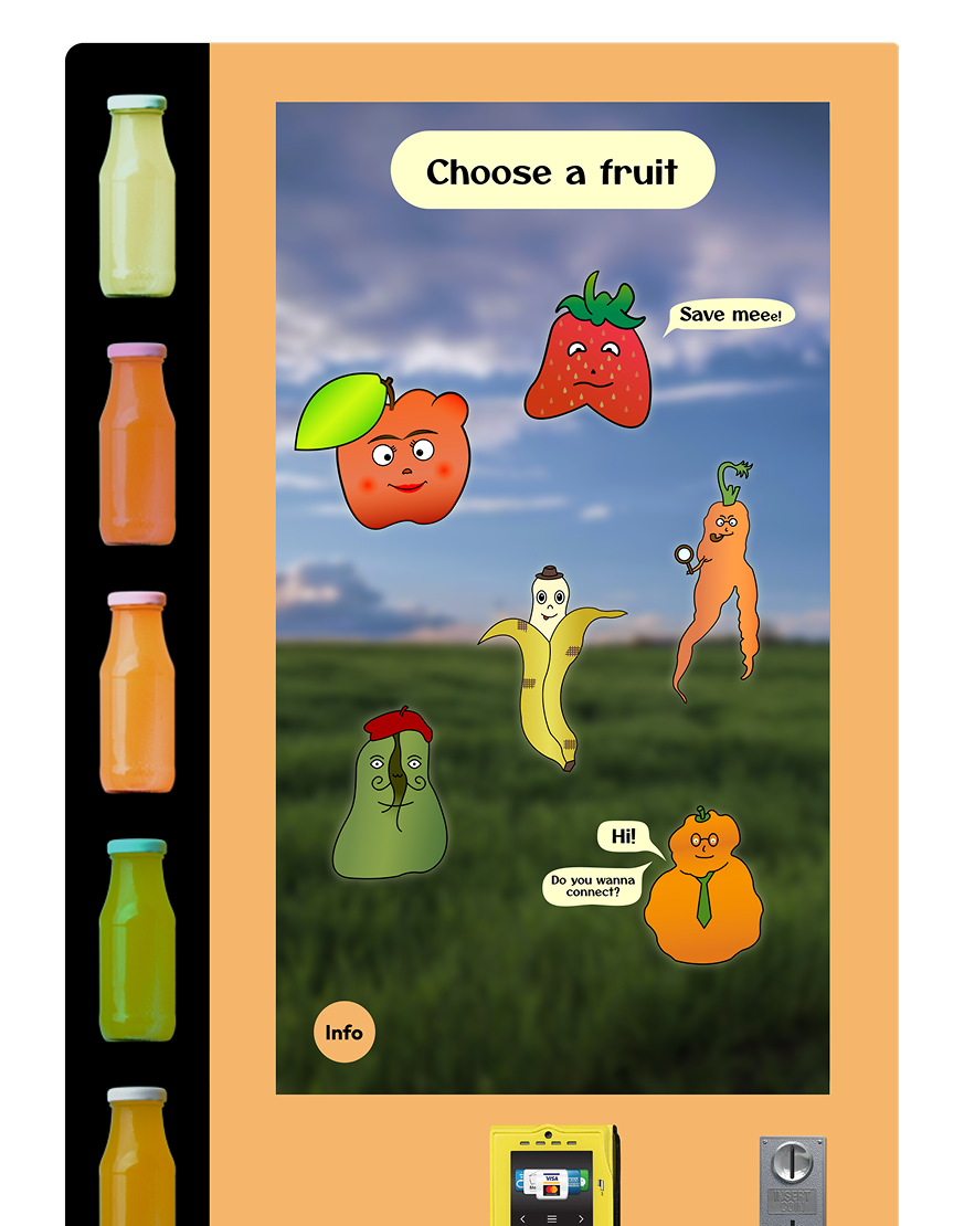
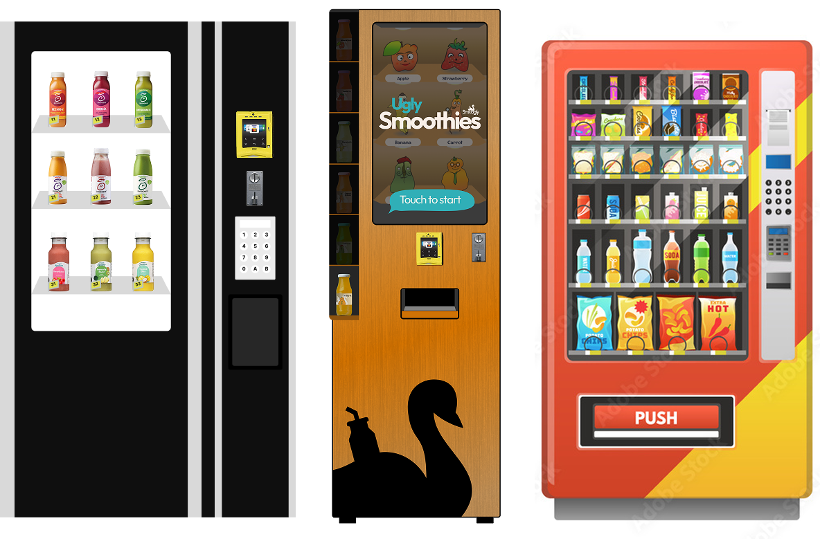
As we only offer six different options of smoothies, fake physical bottles are displayed on the side, while the real storage is hidden behind the screen.
This allows us to have better interactive possibilities, while also avoiding the unnecessary visual clutter of many repetitive bottles on display, swapping it for a more appealing visual.
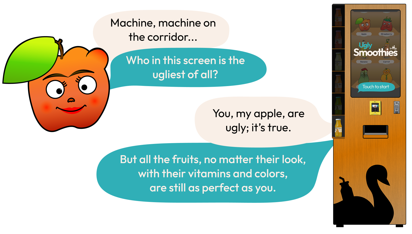
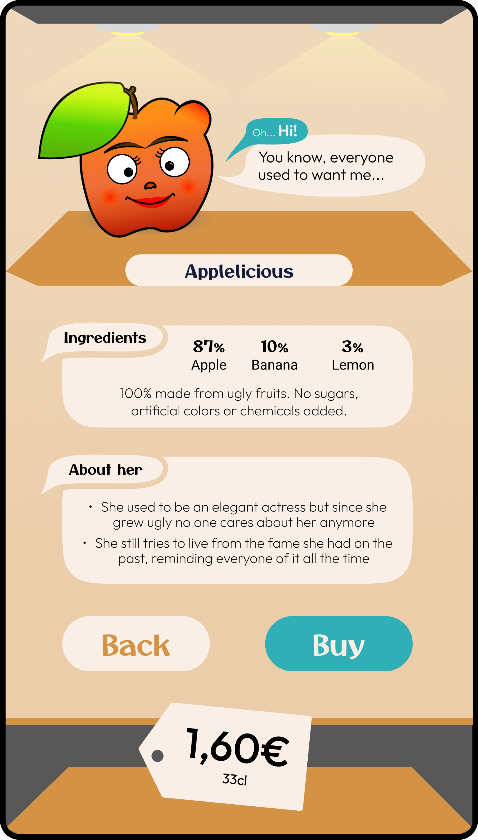
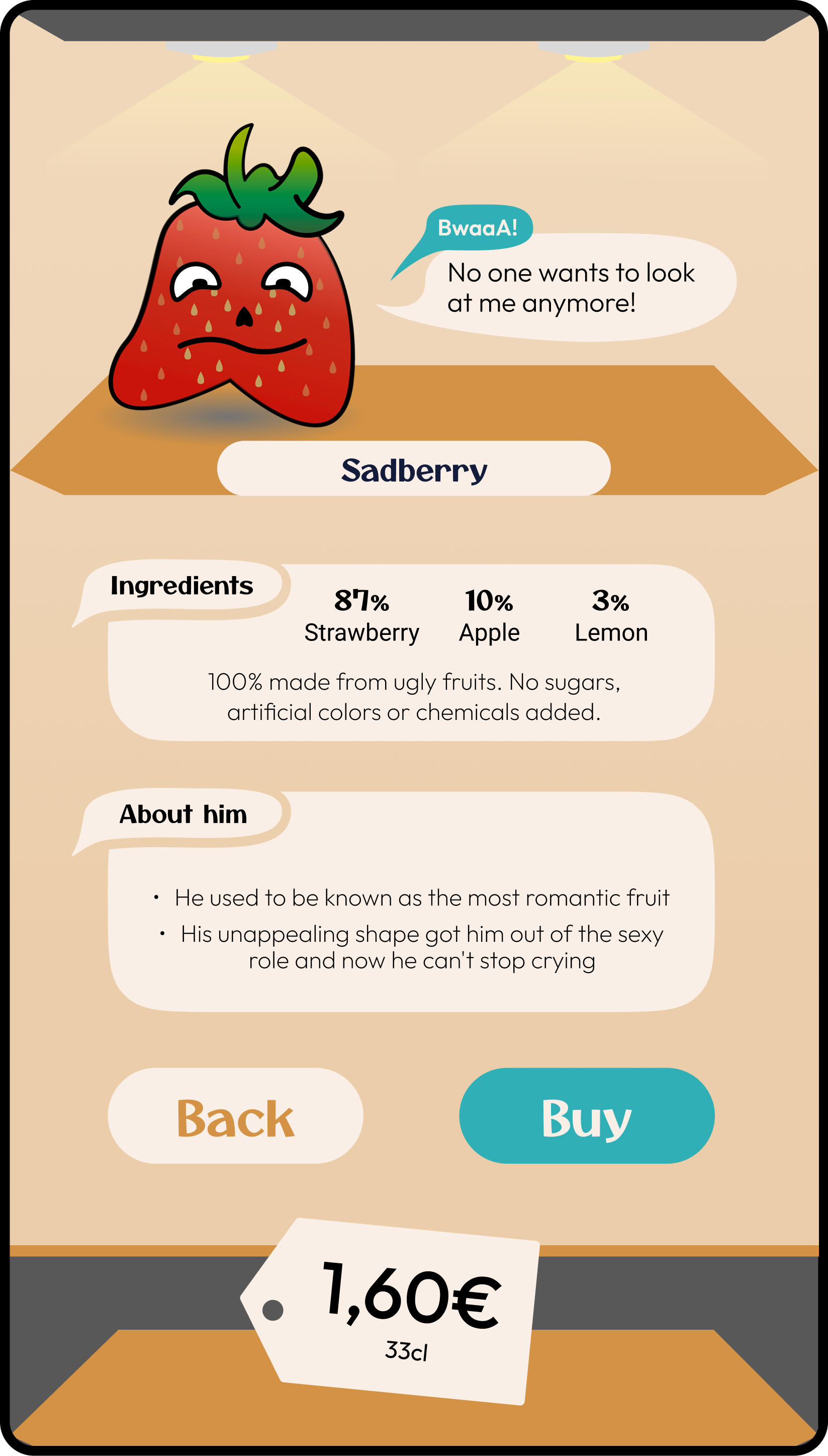
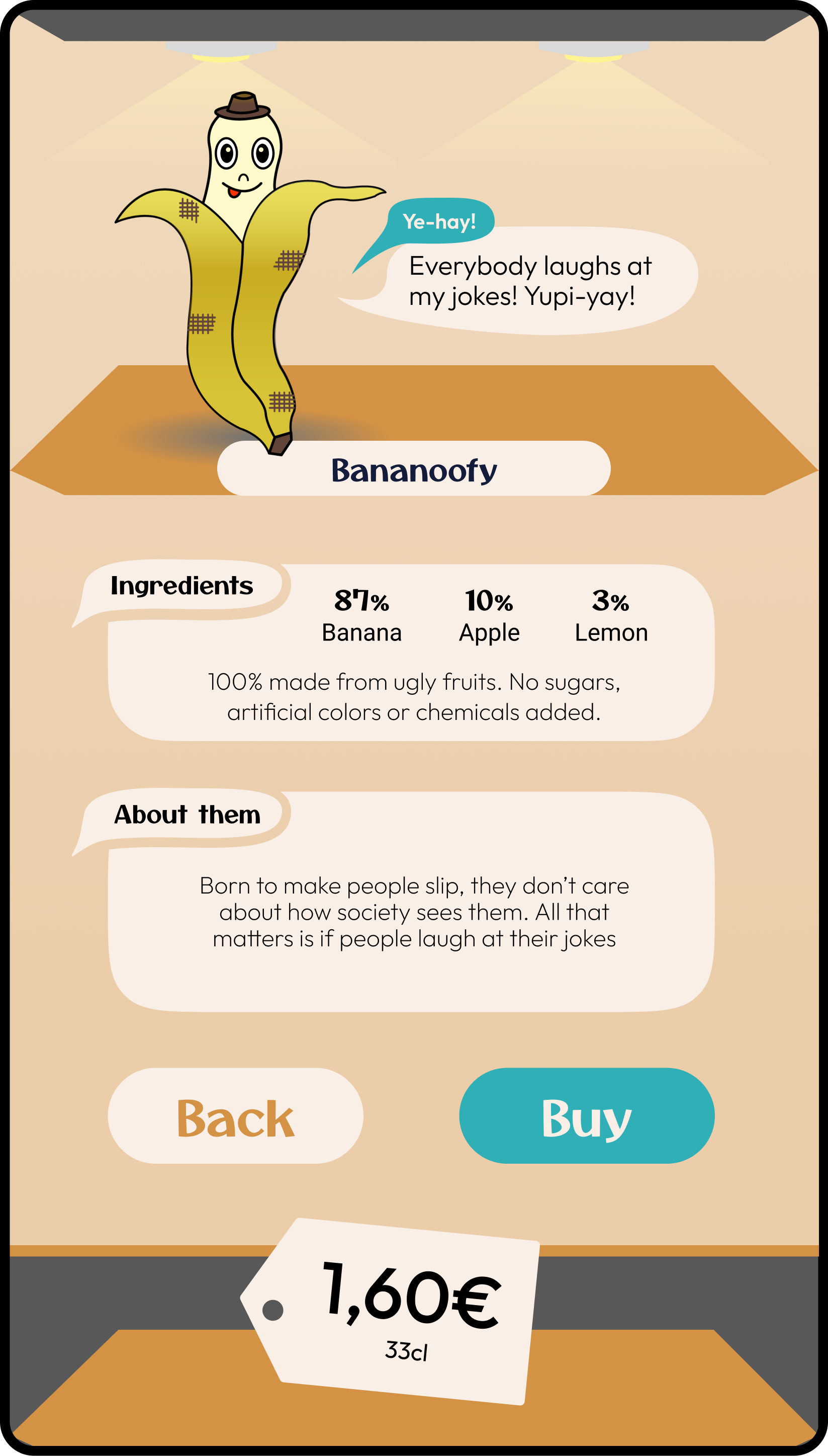
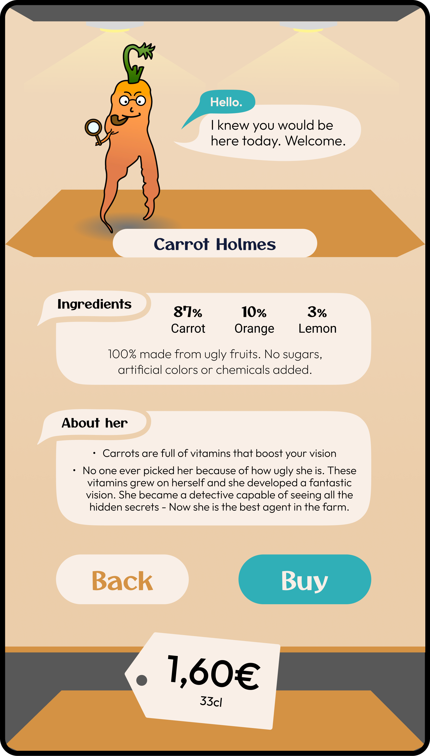
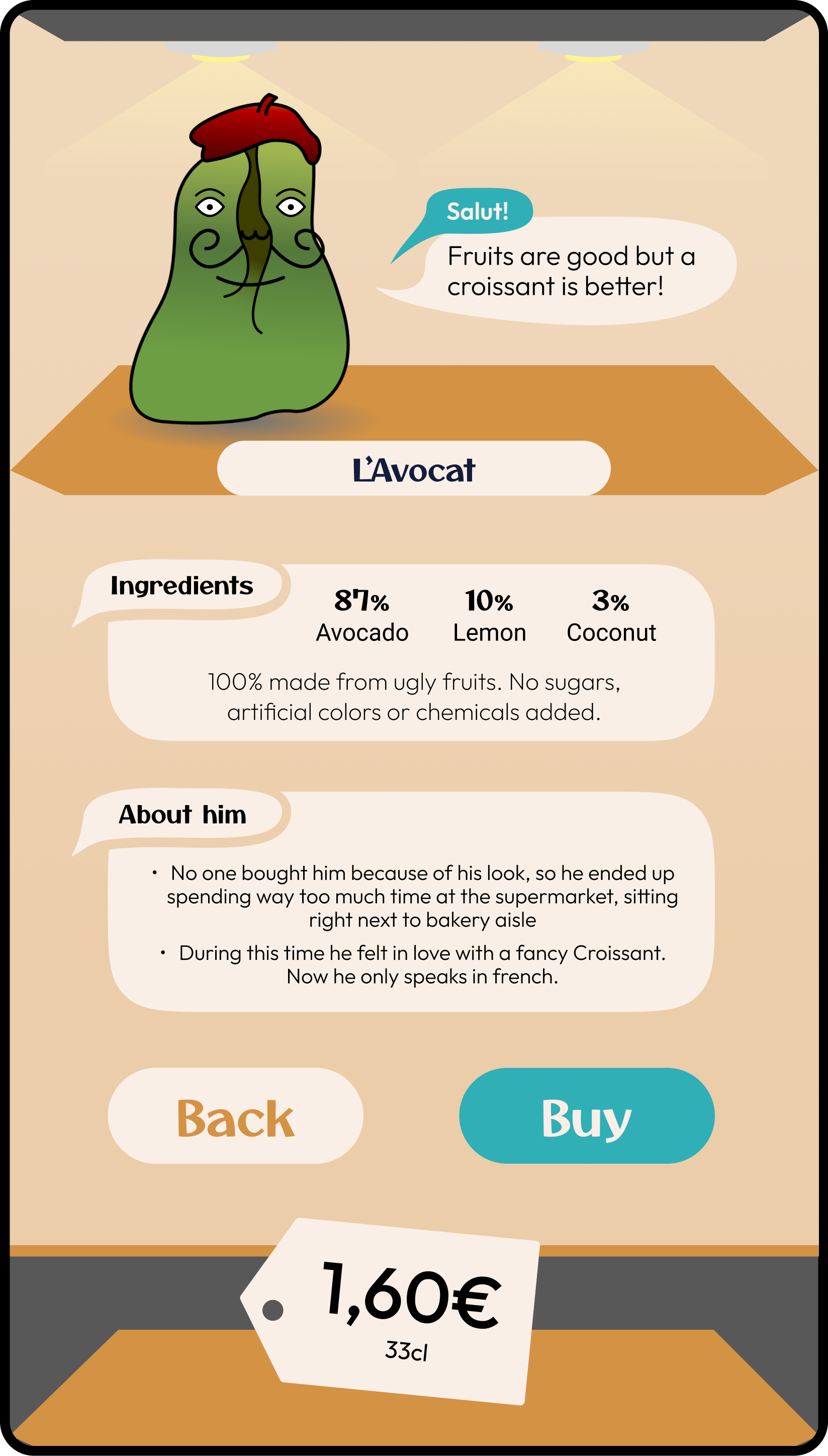
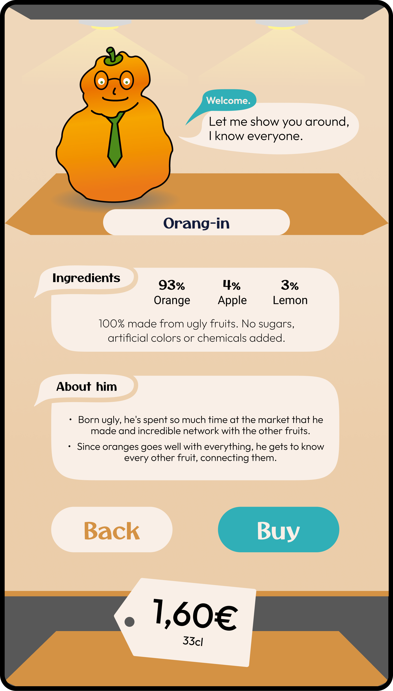
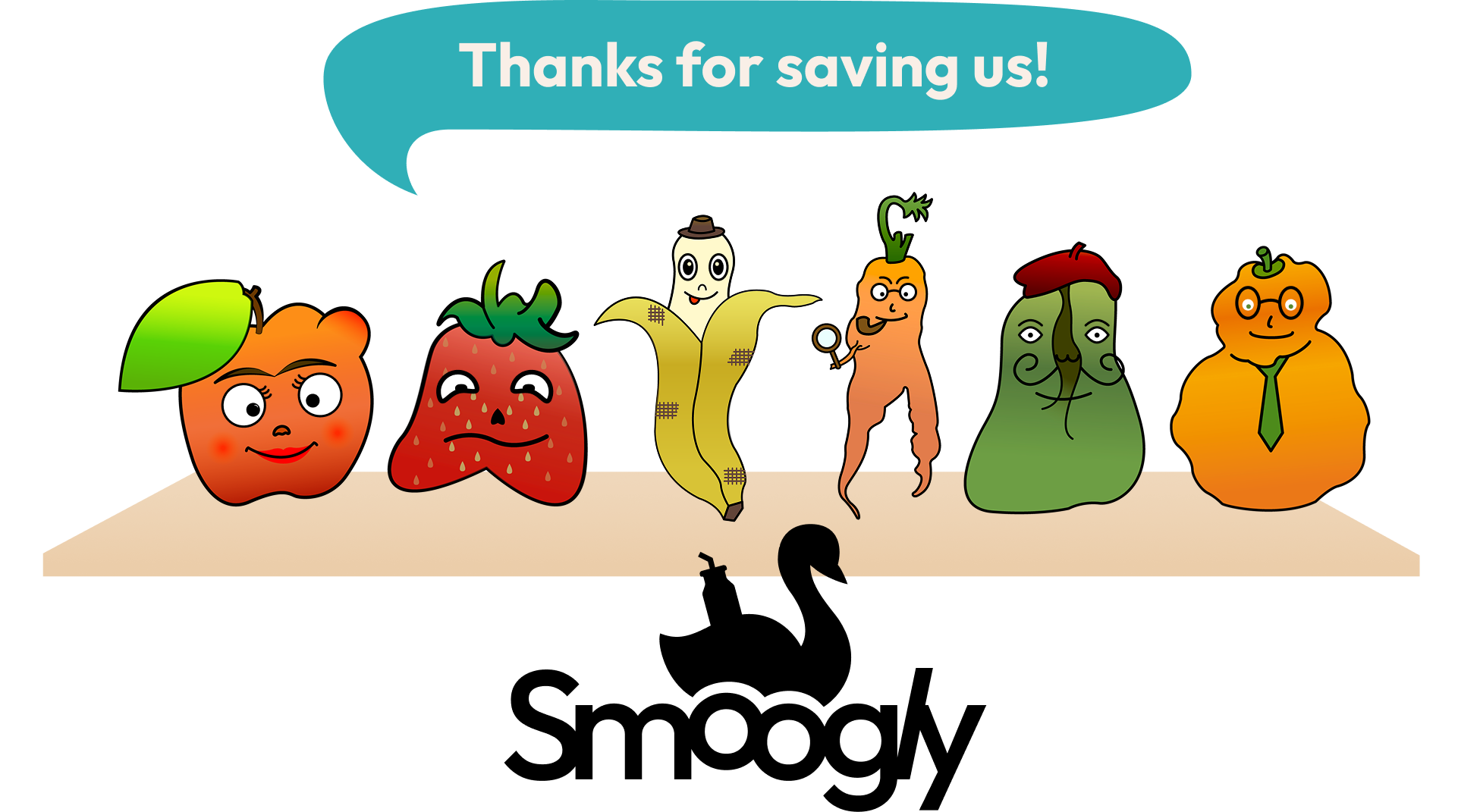
Who doesn't know the Ugly Duckling story? After years being mocked for not fitting his group, he then flourishes and discovers his inner beauty.
That’s the tale of our smoothies: we transform produce that was once considered too ugly to be eaten into beautiful and tasty drinks.
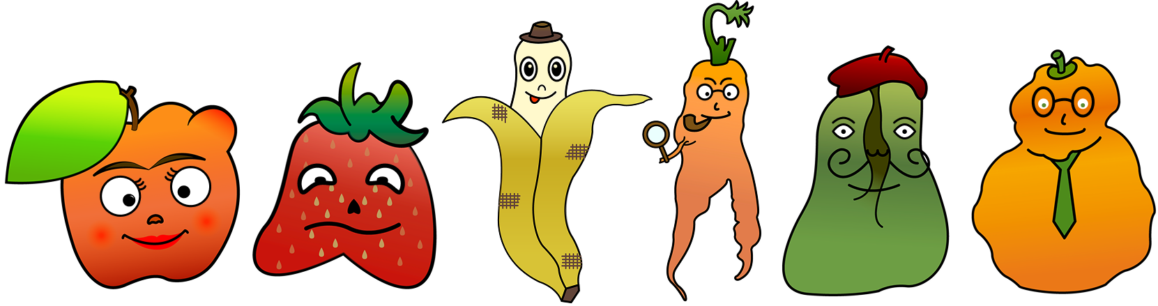
6 anthropomorphized fruits
Each one has their own personality, they embrace their ugliness in a funny way.
This humoristic narrative helps to debias the users on the ”ugly fruits” topic

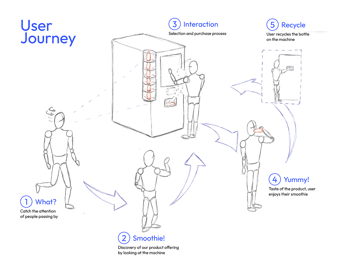
User tests
Objective: See if our idea works for our project goal
☑️ Vending machine
Usability test to see how well the interaction goes.
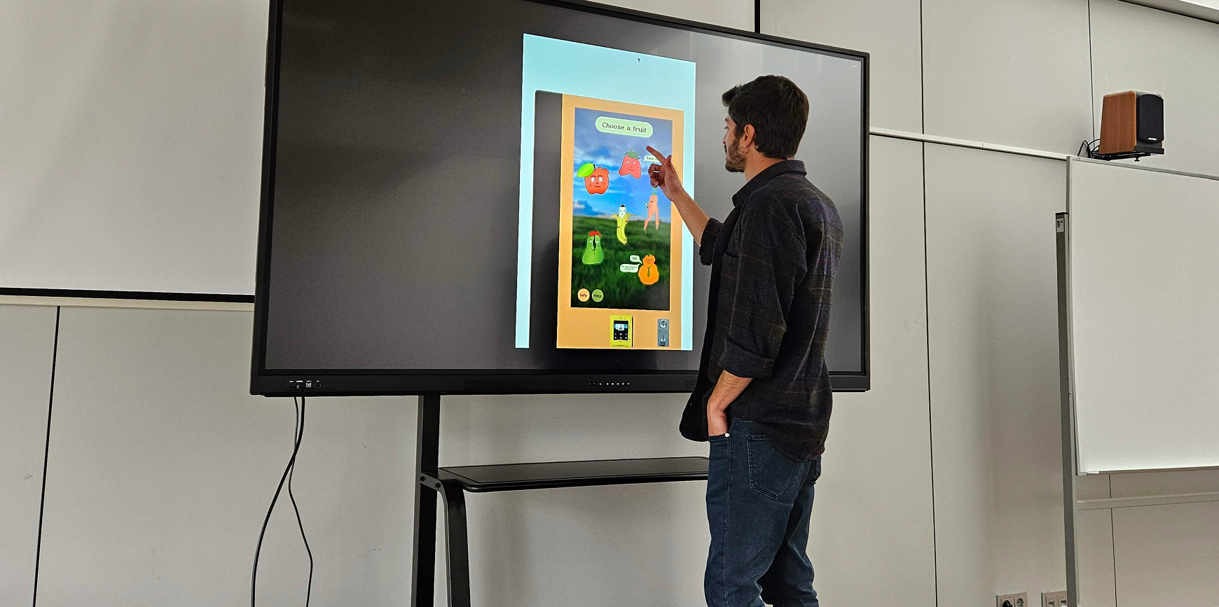
We used a touch screen TV to test the interaction. This allowed us to mimic the machine real height for a better visualization.
☑️ Character style
Fun and SAM tests to understand how users see the characters.
We created 3 different set of fruits to evaluate which one would bring better results.
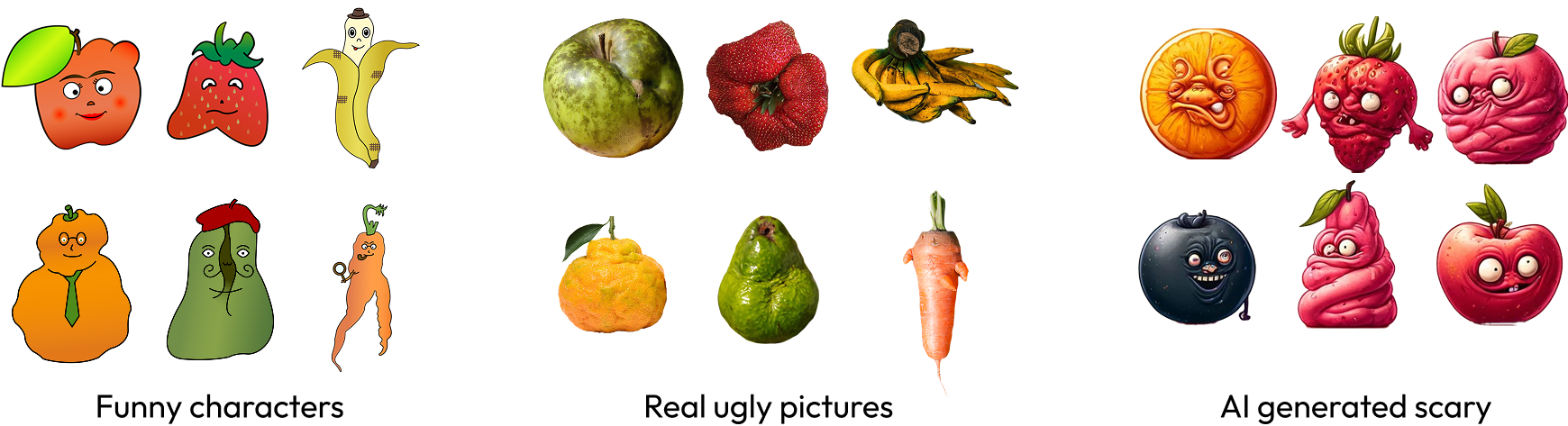

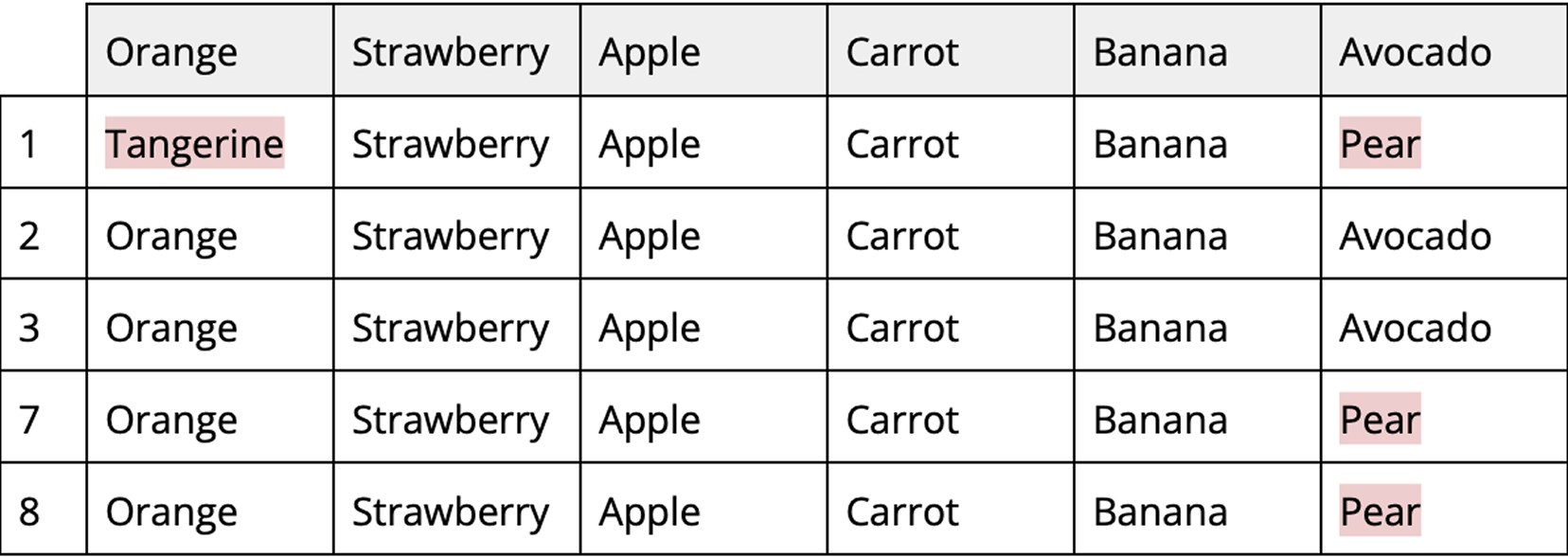
86% of the fruits were correctly identified through the showcased images.

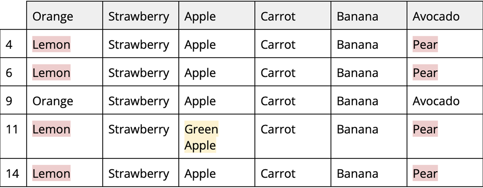
70% of the fruits were correctly identified through the showcased images.

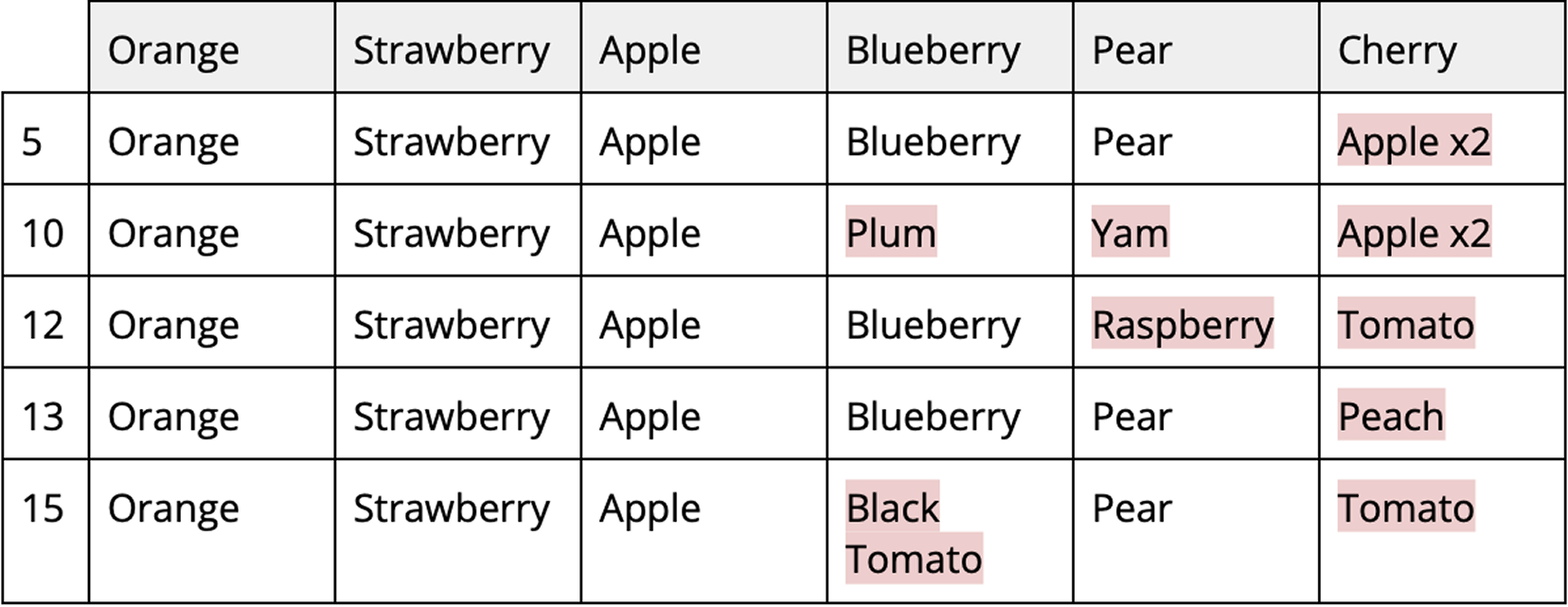
70% of the fruits were correctly identified through the showcased images.


This is the Self Assessment Manikin scale, where users had to choose in what level they felt Pleasure (line 1) and Arousal (line 2).
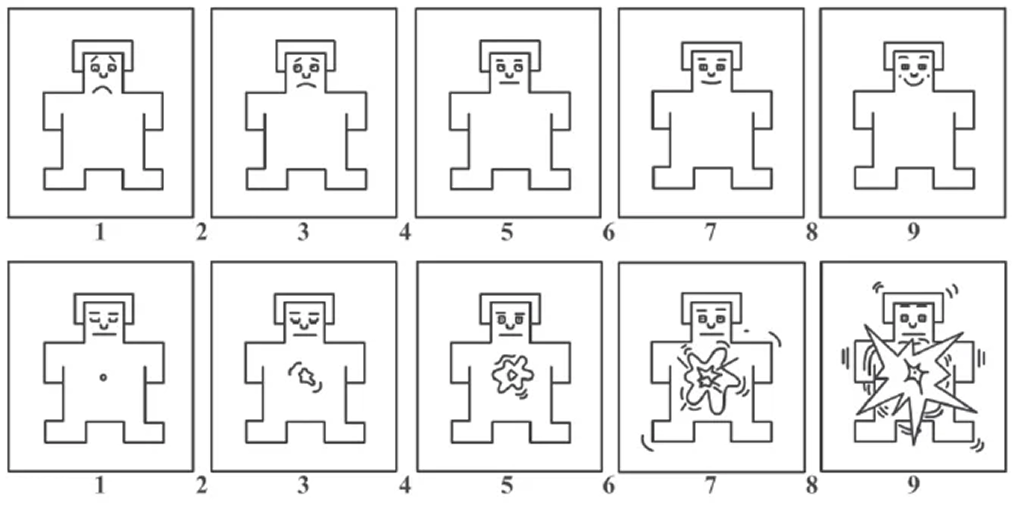
These were the results, by type of image:


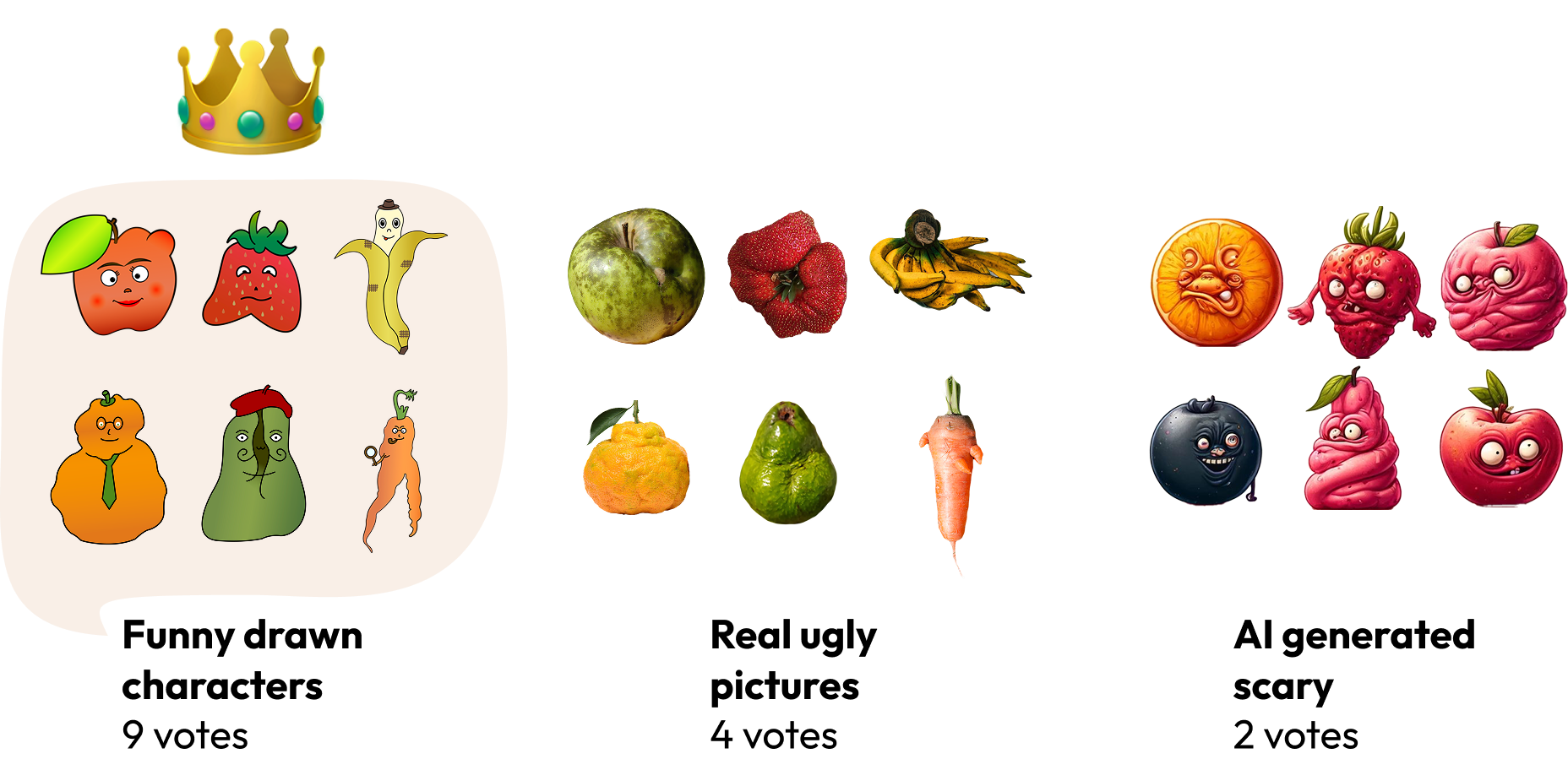

The funny characters, in the drawn style, had the highest rate of users being able to identify which fruits they represented among the options. However, it was still not perfect, so we re-designed the main screen, adding labels to show the name of the fruits, mimicking a real shop shelf.
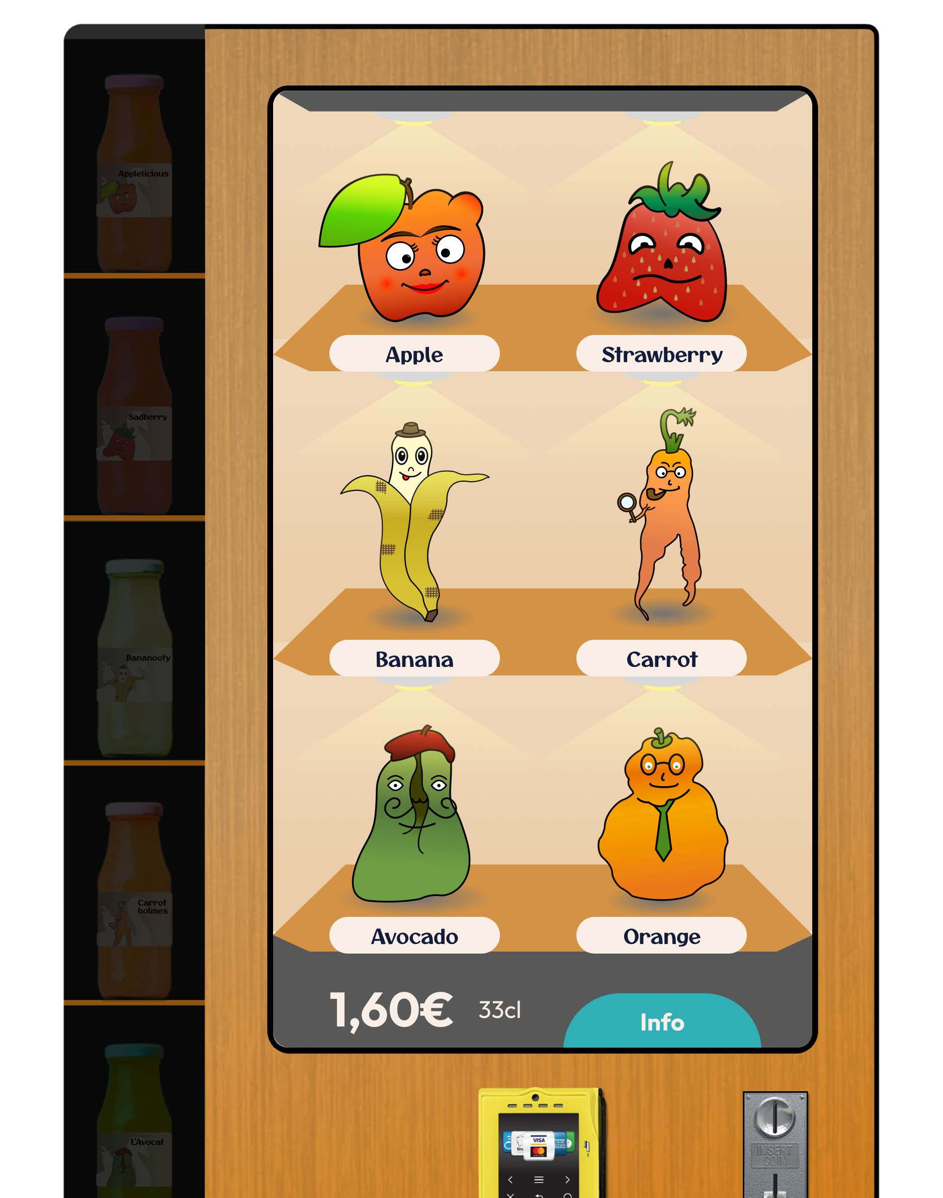
This new visual was also carried for the other screens, bringing a more clean and easy to read scheme to the whole interface.
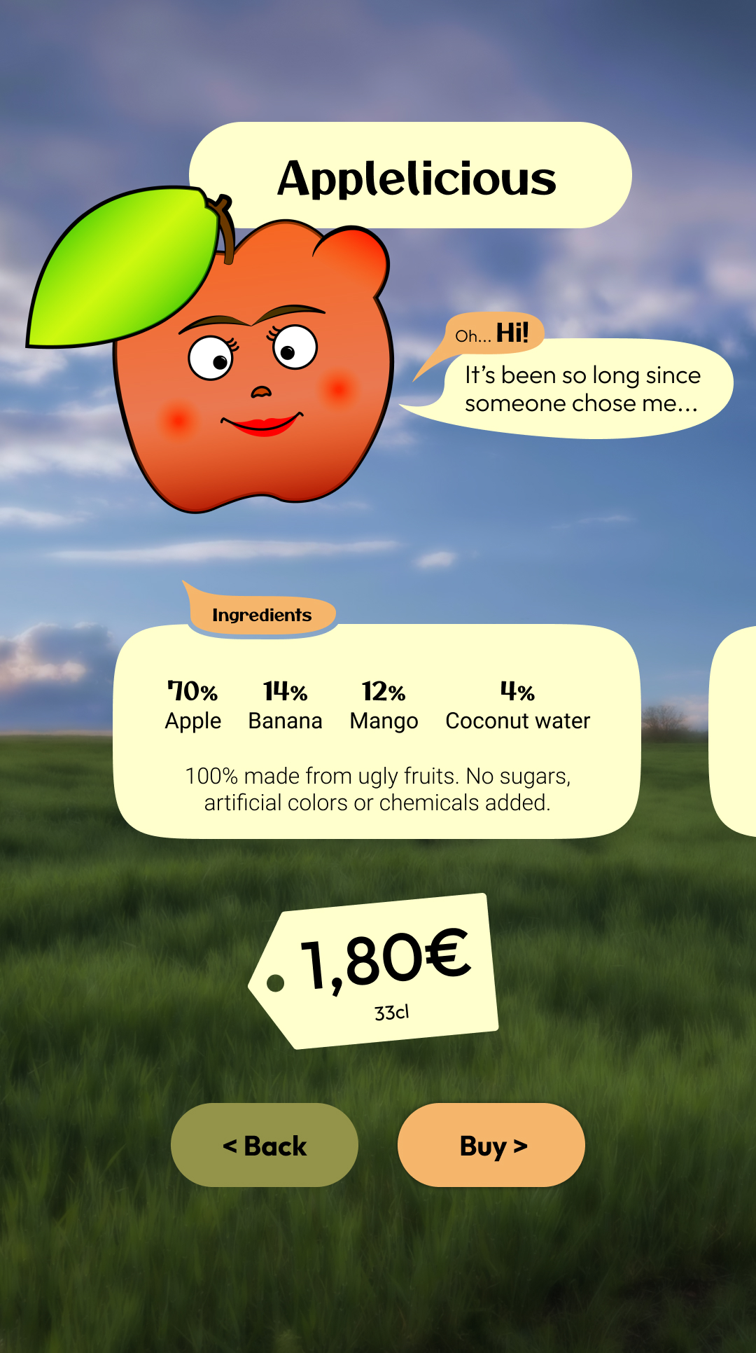
We also removed the scroll to reveal the personal information of the characters, as this was hiding the fun aspect of the interaction. This change brought it to the center of the UI, making it more appealing for the users.

We designed a vending machine based on the research developed together with our colleagues from NOVA School of Business and Economics.
This project reached our goal of bringing to users the idea of buying and giving a chance to ugly produce, taking advantage of an humoristic way to achieve it.
The interactive screen is the highlight of the machine, bringing the characters front and center of the experience. Users enjoyed the fun way to represent the ugly fruits, reporting enjoyment when using the machine.
Some adjustments were made after user feedback, as the fruit names added on the screen, and the final prototype is ready to, just like the Ugly Ducking story, steal the show and impress everyone with how great ugly fruits can be.
Credits
Designers: Alişan Ustun, Felipe Rabaça
Marketing Team: Antonia Janisch, Charlotte Geiss, Johanna Lenz, Jördis Braune, Sophie Dülfer
My Roles: User Research, Interface Design, Usability Testing, Illustration, Visual Identity
Softwares: Adobe Illustrator, Figma
Project type: Group Work
Duration: 4 months